Approximately 8 million tons of furniture end up in U.S. landfills each year, used and discarded as disposable as people move or redo their spaces. Kaiyo is an online platform working to turn this tide, offering a destination where shoppers can buy and resell local, high quality used furnishings. Pentagram has developed the new brand identity and name for Kaiyo, formerly known as Furnishare, along with its positioning, voice and messaging.
Pentagram worked closely on the project with Kaiyo founder Alpay Koralturk, an entrepreneur and environmentalist who wants to change the way consumers view furniture as throwaway and instead show the benefit in “upcycling” and valuable reuse. The branding positions Kaiyo as “eco-modernist”: friendly and optimistic, but also efficient and environmentally conscious―equating sustainability with good, long-lasting design; making buying used a better alternative to buying new; and making good design available to everyone with great finds, on demand.
Kaiyo offers access to a large marketplace of buyers, and most importantly, does all the moving, picking up pieces free of charge. The furniture is inspected, cleaned, and photographed for posting on the Kaiyo site, and sellers get their requested share of revenue if sold. Shoppers enjoy the ease of ordering online and having the pieces delivered right to their homes, at a substantial discount compared to buying new. The service is currently available in New York City and New Jersey, with plans to expand to other large cities.
The company wanted a one-of-a-kind name it could truly own, something that was simple, memorable and easy to pronounce. The name “Kaiyo” was inspired by several cross-cultural associations: in Hopi, the word “kaya” means one who is wise; in Greek it connotes purity; in Japanese, a place for rest; and in Zulu, a dwelling, abode or home. “Kaiyo” feels close to nature and connected to the earth, and captures the brand’s goal for “good vibes” for a better planet.
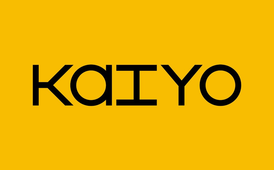
Kaiyo’s custom wordmark is built of geometric lines and circles, with a design that evokes the structure and craftsmanship of furniture. Each character is a monospace, with an equal height and width that fits into a modular square grid. The modules are interchangeable between letters and silhouetted images of items in Kaiyo’s inventory, showing exactly what the brand has to offer.
The modular construction of the logo extends to other brand expressions. The website is clean, clear and easy to use, allowing users to access the full inventory, organized by product type. Typography is set in the sharp Avant Garde Gothic, combined with Space Mono, nodding to contemporary craftsmanship, and the modern approach carries through to a streamlined palette of saturated yellow, conveying the brand’s positivity.
