Letter Groups - Lowercase
REVIEW
Drawing letters (yay!) is the next step after familiarizing yourself with the basic strokes. If you want a review, here are the links:
Blog post: The Basic Strokes
Video playlist: YouTube Tutorials
Letter Groups
I know it could get pretty boring to just keep practicing the basic calligraphy strokes on their own; I think it helps a lot to know where you are actually going to be using these shades and hairlines on, so let’s get to it and put them to work!
I always like to group the letters of the alphabet by the common characteristics that they have. This way, I get to focus on their commonalities and make them consistent at the same time. It also helps my hand get in the zone.
I’ve collapsed the eight basic strokes from the previous lessons into six groups below, where the ovals and reverse ovals are combined into one group, and the lower and upper loops are together too. You may find some letters are listed multiple times. For example, letter p is listed both under the full pressure stroke and the compound curve. When you’re practicing, focus on what group it’s under to avoid getting overwhelmed.
p
d, t - As the extended stem of under turns
f, h, k, g, j, q, y - As part of the loop stem
i, u, w, a
d, t - With an extended stem
l, b - Connected with a loop stem
m, n, r
v, x, p, m, n, h, y
k, r - Smaller version or half turn
a, d, o, g, q - Regular oval
c, e, r - Half oval
x, s, z - Reverse oval
g, j, y - Lower loop
q, z - Lower loop with slightly different shape
f, h, k, b, l - Upper loop
In each of the photos below, I’d like to direct your attention to the parts that are drawn with vermillion ink (orange red).
I also drew each letter group twice: the first time with pen lifts each time the nib hits the baseline or the header line, the second time with just drawing each independent shape in one stroke. For example, an oval can either be drawn in two strokes or in one. You’ll notice tiny gaps at the top and at the bottom where I would stop and lift the pen to get ready for the next stroke (and I don’t mean the gaps between the different coloured inks here). It has a slightly different look too, when you lift versus when you don’t. Some people like lifting because you can get more precise strokes this way. Some people prefer the “flow” you get without any lifts. Try both ways and see which method gives you better results!
FULL PRESSURE STROKE
The full pressure stroke has an even width and it looks like a shaded parallelogram slanted at an angle. Try to keep the same heft not just for this stroke, but for all of your shades.
This stroke appears at least one x-height tall on letters with stems and loops (it could be longer or shorter depending on your preference), while it’s usually three x-heights tall on a standard letter p.
See how the upper stems of p, d, and t all hit the first ascender line, and the lower stems of f and p both hit the first descender line.

First row, left to right: letters f, p, p, d, t. Second row, left to right: letters h, k, g, j, q, y.
The letters above are executed with some pen lifts (e.g. for the letter d, I drew the oval in two strokes instead of one).
Note: I have a tiny cross mark on the first p above because I didn’t like how the first curve of the double turn stroke turned out (too narrow).
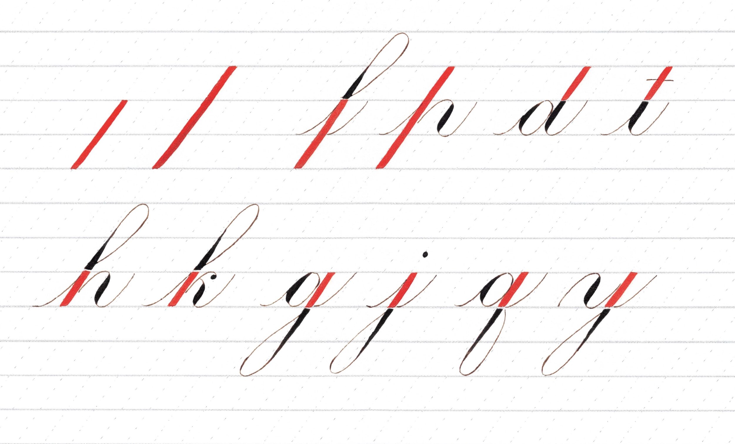
First row, left to right: full pressure stroke two spaces and three spaces tall, letters f, p, d, t. Second row, left to right: letters h, k, g, j, q, y.
The letters above are executed with less pen lifts than the previous photo (e.g. for the letter d, I drew the oval in one stroke, but I would still lift the pen to do the stem next).
UNDER TURN
Try to make your curves the same each time you draw it on the baseline. For example, when you cover the top half of the letter a, the curve of your oval should be the same as the curve of your under turn.
Also, aim for even spacing. Notice how the space occupied by the oval in the letter a is roughly the same space occupied by the under turn.
Note that the eyelets for letters w and b should look the same and that they are located on the left of the hairline (or inside the under turn). The exit stroke of these two letters is just a tiny version of the exit stroke of your under turn.
The dot on the letter i ideally has the same heft as the shade of the under turn. Try to keep it aligned to the under turn too.

First row, top left to right: letters i, u, w, a. Second row, left to right: letters d, t, l, b.
Each under turn above is broken down into two strokes: the shade and the hairline. See the gap at the baseline created by stopping and lifting the pen. Take care to still make it look like the corner of the shade continues to the hairline; unlike the letter l above. :)
Try to keep the curves symmetrical. Compare the letters i and d above; the exit stroke of d is a bit more open than the i’s.
Also try to keep the under turns as consistent as possible; it gets particularly obvious when there’s two in a row, haha! Look at my w above, the first under turn is a little off the slant so it looks different than the second under turn.

First row, left to right: letters i, u, w, a. Second row, left to right: letters d, t, l, b.
The under turns above are drawn in one stroke, without doing any lifts at the baseline.
Take care to ensure that the shade tapers off at around the same point for all your under turns. If you look closely at b above, the shade ended a little higher than it did for the letter l. Do as I say and not as I do :))
Also, the loop on l is bigger than b’s, but that’s okay; let’s focus on the under turns on this exercise and talk about the loops later.
OVER TURN
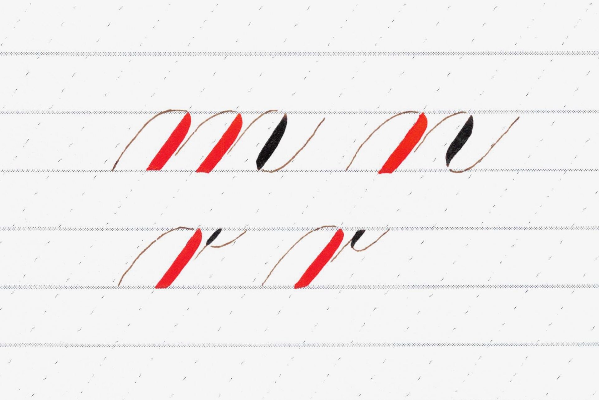
First row, left to right: letters m, n. Second row, left to right: letter r, two versions. Notice where the tiny shade of r lies with respect to the straight hairline.
Each over turn above is broken down into two strokes: the hairline and the shade. See the gap at the header line created by stopping and lifting the pen.
Sorry for the flattish hairline curves for m and r; I struggle with that and definitely need more practice! :)

First row, left to right: letters m, n. Second row, left to right: letter r, two versions. Notice where the tiny shade of r lies with respect to the straight hairline.
The over turns above are drawn in one stroke, without doing any lifts at the header line.
Take care to ensure that the shade starts off at around the same point for all your over turns. If you compare the two versions of r, the shade on the first one started a little bit sooner than the second r. Not enough to be noticed I think, but something to watch out for.
Also, ideally, when you rotate your over turns by 180 degrees, it looks like your under turns. That means that the transition point too, from thin to thick and vice versa, should mirror between your under and over turns.
COMPOUND CURVE / DOUBLE TURN
Now this shade is something I struggle with in terms of consistency, especially if I’m writing at a smaller x-height, because that would mean a shorter time to transition between thin to thick and back to thin again. But essentially, if you practice both under turns and over turns a lot, this compound curve should not be too hard for you. I apologize if my execution below aren’t the most consistent looking, but I hope they still serve their purpose, which is to illustrate similar letters! :)
Ideally, where the shade starts should look similar to where it starts for your over turns. Conversely, where the shade tapers off should be the same to where it does for your under turns. And, for balance, when you flip it upside down, you should see the transition points to be the same for both the top curve and bottom curve.
Notice how the size differs for the letters k and r because the stroke starts lower than the header line. These letters also don’t utilize the full double turn; only just about half of it.

First row, left to right: letters v, x, p, m. Second row, left to right: letters n, h, k, k. Third row, left to right: y, r.
The compound curves above are broken down into three strokes: the left curve, the shade, and the right curve. See the gaps created at the header line and baseline from lifting the pen at these points.
Watch the spacing; in the letter m above, I think I made the first half of the compound curve narrower if you compare it to the over turns.
Try to keep the width of the shade mostly even, except for where the curves occur at the top and at the bottom. It’s nice if you could keep the edges of the shade mostly straight and aligned with the slant. The shades on letters v and n look a little bottom heavy in the above example.

First row, left to right: letters v, x, p, m, n. Second row, left to right, letters h, k, k, y, r.
The compound curves above are drawn in one stroke, without taking breaks where the curves meet the header line and the baseline.
Where my shade starts at the top of the double turn aren’t particularly very strong in the above photo, can you see it? :)
OVALS - regular and reverse
Ah, the oval :) This is arguably the most important basic stroke to learn and get good at because it’s a key stroke in copperplate or engrosser’s script.
The curves of your over turn and under turns should match the curves of your oval. It follows that the width of your oval dictates the width of all your other basic strokes: under turns, over turns, double turns, reverse ovals, and the space inside the loop strokes.
In the following photos, the letters don’t necessarily have the full oval shape because the hairlines don’t always close the oval (like in c, e, r), but focus on how similar the shades are and the space the oval (or half oval) occupies in each letter.
I apologize if the shades look slightly thinner in this group than in the other groups. :) I did the batches in different days and I guess when I did this group I was feeling light handed! Ideally, keep your shades the same heft all through out the alphabet.
Note that the letters s, z, and x here use the reverse oval, where the shade in on the left side of your oval instead of the right, and you draw the shade clockwise instead of counterclockwise. I decided to draw them in the same group as the regular ovals to illustrate that they’re the same family, just upside down.
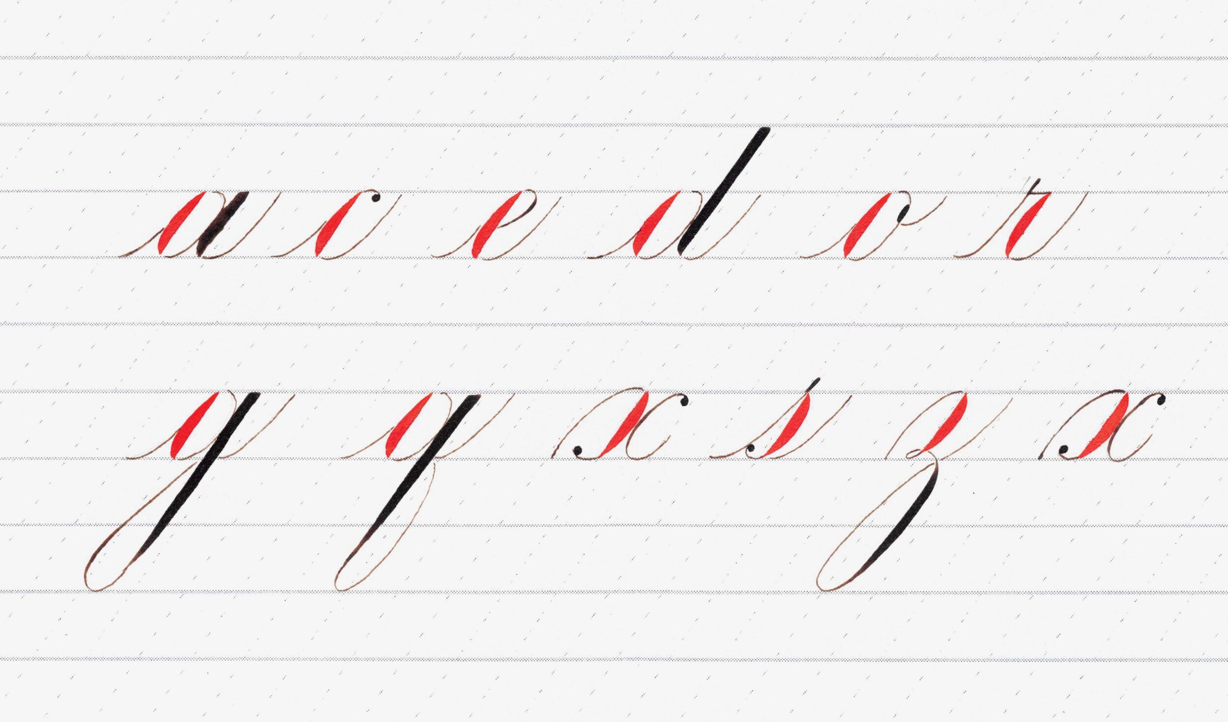
First row, left to right: letters a, c, e, d, o, r. Second row, left to right: letters g, q, x, s, z, x.
Look at the shades above and imagine being able to turn them into under turns by filling in the negative space at the top left. That’s one way of keeping your ovals and under turns consistent looking with each other too.
Conversely, imagine being able to turn your reverse ovals into over turns by filling in the negative space at the bottom right.
I find it easier to keep the inside edge of the shade straight when I do them with a pen lift, like in the above batch, versus doing the oval in one stroke, like in the below photo. Notice how the inside is more curved in the photo below compared to above. Both are fine as long as you choose the one that makes it consistent across all your letters.

First row, left to right: letters a, c, e, d, o, r. Second row: left to right: letters g, q, x, s, z. Third row, left to right: letters x, z, x.
You can decide how you want the shade to look like: do you want it to be evenly spread, or a little heavier at the bottom? In the above example, notice how the shade of r is a little bottom heavy compared to the letter o beside it.

Letter s
I didn’t feel like I made a good s in the other groups, so I decided to do it solo here. Notice how the shade is a little top heavy. It’s better to do your reverse ovals top heavy if your regular ovals are bottom heavy.
Notice how the entry stroke is similar to the exit stroke. They curve the same way, approaching the 55-degree slant, and they look equidistant from each other.
Also, turn this upside down and it should resemble letter c! Although that hairline to the terminal dot could have been smoother.

From left to right: letters z, x.
Here’s another try at the reverse ovals for z and x. The bottom right curve of that shade for x could have been more graceful; I think I made it too straight.
LOOPS - Lower and Upper
Notice the teardrop shape inside the lower loops. If you rotate it 180 degrees, it should be the same as your upper loops.
Imagine bisecting the space inside the loop with a line that runs from the corner to the curve. It would be nice to have the curves symmetrical enough that you end up with two equal parts, like you’re able to “fold” it up nicely in half and the curves would fit.
Try to keep the same amount of space inside the loops, regardless of the letter it’s attached to.
A good rule of thumb is that the curve of your loop resembles the roundness of your oval. It follows that its width is congruent to an oval width too, but of course, you could decide to make it narrower for style purposes. I wouldn’t make it wider than an oval width though, because if you have consecutive loops, they’re going to overlap each other.
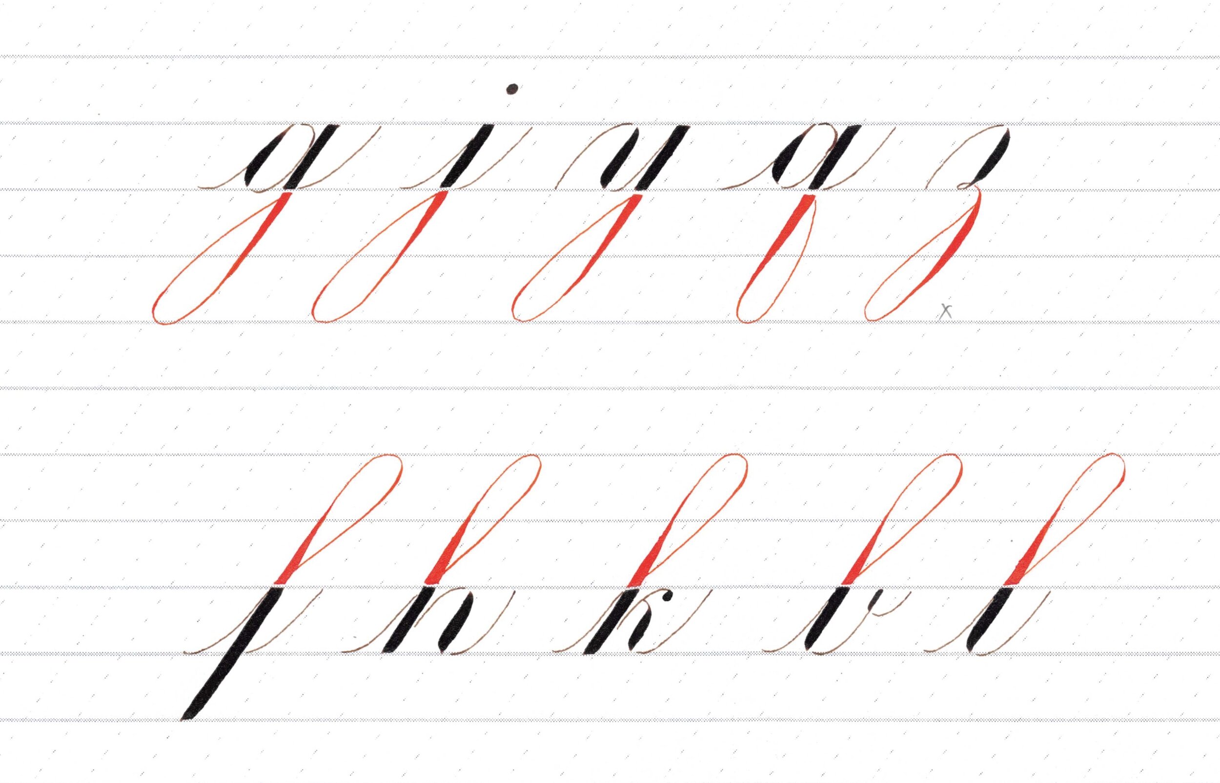
First row, left to right: letters g, j, y, q, z. Second row, left to right: letters f, h, k, b, l.
I penciled in a cross mark on the z above because I didn’t like how I closed the loop too soon. Notice the area inside the loop is a bit smaller than the others.
Try to keep your transition points at the same heights (where you switch from thin to thick or the other way around). See how high the shade ended for letter j above compared to the letters beside it (g and y). Ooh! And I just noticed that I forgot the exit stroke for the letter y above, sorry about that!
Another critique I have is that the b looks a little more bent forward than the rest because of the way the upper left curve went.

First row, left to right: letters g, j, y, q, z. Second row, left to right: letters f, h, k, b, l.
My l looks a little off slant in the above example. See how it’s bent forward compared to b.

Letter q.
Okay! I think this is a q I’m happier about compared to the other q’s I made in the group photos. Imagine flipping the loop to the left side (like a mirror image), you will get a g!

From left to right: letter q, three versions of z.
The letters q and z are the eccentric-looking ones in the group so I wanted to write them a few more times.
I drew z three times above; notice how the top portions are different. The first and last z both use reverse oval shapes, with the loop differentiating them, while the middle z uses an over turn.
I like to do the shade of the z once I passed the baseline so that when it’s time to draw the enclosing hairline of the loop and make it into an exit stroke, it crosses a hairline instead of a shade.
Bonus - Feedback
I hope you enjoyed this blog post! You can also find them on Instagram with the #learnwithmaxie hashtag.
Feel free to use the letter groups I illustrated above in your own practice. As a bonus, you can send me your practice sheets (scan it or take a top-view photo and email it to me at maxiecalligraphy@gmail.com) and I can give you some feedback! You can use the guidelines I have in the Resources page. I find it really helpful to have someone else’s eyes look at my work and point out things I may or may not have seen that needs improvement. I could do that for you too, at no cost; just give me a turnaround time of about a week. :)
If you want to take it further and do a private lesson where I could demonstrate live, watch you do it, and give real-time feedback, we could do that too! Head over here to contact me with your details.