Why do the Alphabet Letters of [a] and [g] have Different Forms in Print?


In the beginning, there was Spoken Language; and eventually all in a family or community began to agree on the use of common words.
Later, language was written down – an alphabet had to be formed to express the sounds and words of the Spoken Language.
Capital letters were written first; and lower-case letters evolved as writing needed to speed up – some have a completely different character (e.g., A/a, E/e, Q/q, R/r) andare simply a smaller version of the upper-case letter (e.g., P/p, S/s, W/w).
Students spend hours in school today learning how to shape their printed alphabet letters correctly so they can be recognized by all.
The single-story [a] and [g] were used.
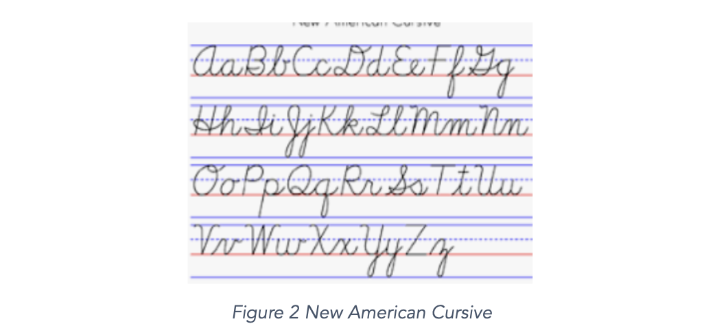
And then, cursive writing became popular because it was a faster way to write and copy information – this required linking together letters without lifting the pen, and letter forms were altered for this purpose.

The single-story [a] and [g] continued to be used, with lines connecting them to letters to the right and left of them.
And handwriting is the only reason the single-story [a] and [g] survived the onset of mechanically printed material – it is too difficult to handwrite the double-story letter forms of [a] and [g].
The Printing Press was invented, and printing typeface changed the shape of some letters to fit the needs of printing to avoid blurring and mistaking individual letters.
The double-story [a] and [g] were used – and continue to be used in most documents, books, and printed material today.
Digital printing on paper, on screens, on dashboards of airplanes, on billboards again changed the look of the letters of the alphabet to meet the highspeed, precise, and sometimes stylish printing needs.
The double story [a] and [g] continue to be used in all forms of printing today.
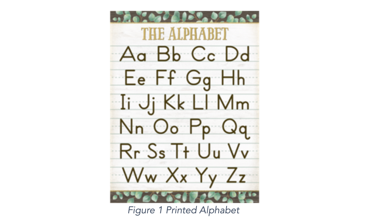
However, the familiar strip of alphabet letters lining the walls of elementary classrooms and early reading materials usually contain the single-story [a] and [g] – because the shape can be hand printed as well as written easily in cursive.
Students are expected to make the intuitive leap in the early grades to recognize the double-story [a] and [g] letter styles when learning to read and reading to learn.
The team of Magical I Am has chosen to go with the digital world of print, which students see so much of at all ages on their devices, and to use the double-story form of alphabet letters [a] and [g].
Amazingly, few teachers even consider the required transition to reading [a] and [g].
Teachers learned to write the single-story [a] and [g], and that is what they write on the white or black boards and teach to K-1 graders. Then, at some point in learning to read in grades K-1, the child encounters the double-story versions of [a] and [g], and learns to read them fluidly... If they have already mastered both the lower-case and upper-case alphabets that line the walls of their classrooms.
Mastering the alphabet is not learning to sing the alphabet song – Singing the alphabet is a poor rote drill tool. Each letter of the alphabet must be clearly visualized and recognized wherever it is met, without hesitation or error in recognition. The easiest way to accomplish this, and to defeat the appearance of knowing the characters of the alphabet that the rote singing of the alphabet song suggests, is to learn to visualize the characters of the alphabets (upper- and lower-case) in reverse. Once this is accomplished, the child has mastered the alphabets (upper- and lower-case) and will always recognize all alphabet letters when they are seen in print.
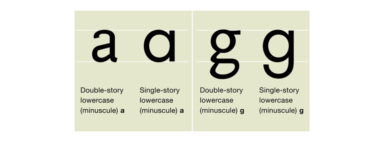
What is a single-story or double-story letter?

Lower-case letters vary in their height above and below line of writing:
some have higher parts (ascenders - e.g. b, d, f, h, k, l, t)
and some have lower parts (descenders - e.g. g, j, p, q, y).
A letter can have 3 parts:
A bowl – that is called the aperture. It is an enclosed circular part of the letter character.
A finial – a curved tail; also called a terminal.
A stem – also known as the stroke; it is the main vertical line of a letter character.
The Lower-Case Double-Story [a] has all three of these elements. The closed bowl is at the bottom, and the stem goes up to a curved finial arm at the top hanging over the bowl, creating a partially enclosed area above the bowl.
The Lower-Case Single-story[a] has a rounded, closed bowl and a stem – no obvious finial.
Fun fact, google recently changed from its previous [g] to the written style [g].
They also changed the colors and simplified all of the letters.

