Mini Lesson/Activity
Identifying Patterns in PM 2.5
Overview
Students will synthesize information from maps that show population, concentrations of PM2.5, and PM2.5-attributable mortality across the globe in order to draw conclusions about the relationship between particulate pollution and human health.
Student Directions
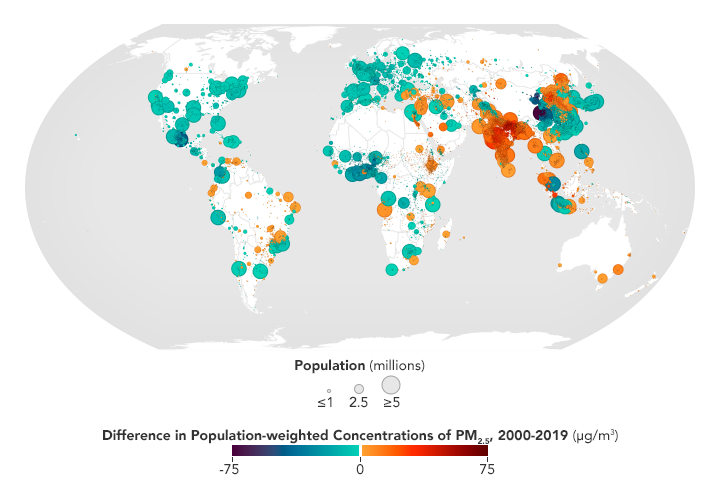
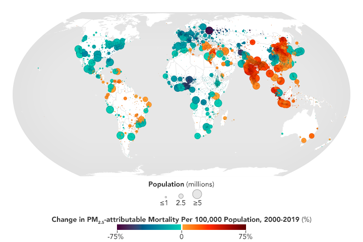
Air pollution is the fourth leading risk factor for death around the world. But one type of pollutant is particularly harmful: fine particulate matter (PM2.5). These small, inhalable particles (less than 2.5 micrometers in diameter) result from direct emissions into the air, as well as interactions among other pollutants. PM2.5 is the leading cause of death among air pollutants, contributing to cardiovascular and respiratory disease and millions of premature deaths worldwide each year.
The maps below show the changes in PM2.5 concentrations and mortality for urban areas around the world between 2000 and 2019. The first map shows absolute change in PM2.5 concentrations weighted by population. The second map shows the percentage change in PM2.5-attributable mortality rates per 100,000 population. Cities in Southeast Asia saw some of the largest annual average increases in both metrics.
Review the maps and answer the questions using the table.
Steps:
- Check with your instructor on how to submit your answers.
- Observe Map A then respond to the first “I see” prompt below. Then, observe Map B and respond to the second “I see…” prompt. This second observation should be related to your first “I see” prompt. It is recommended that you make an observation about a certain region of the world then make a follow up observation about that same region.
- Draw a conclusion based on your observations of both maps, responding to the prompt, “This means…”
- Make an inference that could explain your conclusion then develop a question related to your observations.
- Repeat 1-2 more times.

Sources:
- Pratt, S. E. (2022, March 14). No Breathing Easy for City Dwellers: Particulates. NASA Earth Observatory. Retrieved August 25, 2022, from https://earthobservatory.nasa.gov/images/149580/no-breathing-easy-for-c…
Teacher Note
Teachers, these mini lessons/student activities are perfect "warm up" tasks that can be used as a hook, bell ringer, exit slip, etc. They take less than a class period to complete. Learn more on the "My NASA Data What are Mini Lessons?" page.
Teachers who are interested in receiving the answer key, please complete the Teacher Key Request and Verification Form. We verify that requestors are teachers prior to sending access to the answer keys as we’ve had many students try to pass as teachers to gain access.
It is recommended that teachers implement this mini lesson after their students have engaged in the two mini lessons: “Particulates and Population” and “PM2.5 and Mortality.” All three of these mini lessons are based off of the NASA Earth Observatory article, No Breathing Easy for City Dwellers: Particulates.
Supported NGSS Performance Expectations
Complementary Mini Lessons


Complementary Models


Document Resources
Interactive Files
Grade Band
- 9-12
Time
- 30 minutes