Tiger's new look
Apple and Spotlight
menu icons
Tiger doesn't match Panther in terms of the sheer number of seemingly arbitrary graphical changes, but it's got its share. To start, the Apple menu icon has changed yet again. It's now a brighter, flatter shade of blue. I think it's a bit gaudy, but it matches up nicely with the new icon in the opposite corner of the menu bar, a magnifying glass icon that we'll learn more about later. The graphite versions are a lot more subdued.
The biggest arbitrary graphical change in Tiger is the new unified titlebar/toolbar window style. It looks kind of like the titlebar simply grew downward, overwhelming the toolbar area.
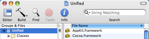
The new unified titlebar/toolbar look
I have no idea what motivated this change, or why some applications use it and some don't. Mail uses it; TextEdit does not. System Preferences uses it; Disk Utility does not. Spotlight uses it; Preview does not. Xcode uses it, but not in every window. You tell me the pattern here.
If I had to guess what motivated the creation of this new style, I'd say it was done to eliminate a line (the line between the titlebar and the toolbar) that someone at Apple decided was unnecessary clutter, and to increase the size of the drag area for non-metal windows. These new windows can be dragged by clicking and dragging on any "gray" area in the titlebar or toolbar.
I'm not sure how smart it is to encourage users to try to drag by clicking in an "empty" area of the toolbar. The click activation regions for toolbar buttons are not always easy to predict. They often extend well beyond the bounds of the toolbar graphic itself. And even ignoring that, who wants to get in the habit of aiming between buttons anyway?
But who knows, maybe I will start dragging these windows using something other than the top 22 pixels that used to be the clearly delineated titlebar. After all, I got used to "sticky" pull-down menus too, right?
As for the elimination of that darned line, well, just look at how that worked out for menu separators. They disappeared in Mac OS X 10.0, much to my disappointment, only to make their triumphant return in 10.3. I am "pro line" in this case as well, although not strongly so.
Incidentally, this is not really a totally new window style. Instead, it's simply a variant of the normal (non-metal) Aqua window style. In Interface Builder, it shows up as a checkbox option called "Unified title/toolbar." The option applies to normal windows only; the checkbox is disabled for brushed-metal windows.
One application in particular deserves a special mention for its graphical sins: Mail, Apple's unimaginatively named e-mail client. It uses the unified titlebar/toolbar look, but that's not the problem. The problem is the buttons that sit in the toolbar. This is what the Mail toolbar buttons used to look like in Panther.
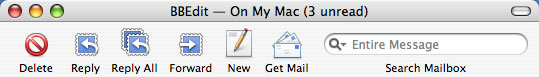
Panther Mail toolbar
Here's how they look in Tiger.
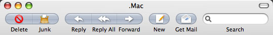
Tiger Mail toolbar
I don't know about you, but I like the Panther look a heck of a lot better. The first time I saw the new Mail toolbar, I filed a bug on it. (Radar 3968093: "Toolbar buttons in Mail 2.0 are hideously ugly.") It was immediately closed as a duplicate, so at least one other person agrees with me. (Maybe it was this person.)
The whole Mail application looks like it got beaten with the ugly stick in Tiger. Take a look.

Tiger Mail
(No offense to "the minds behind Tiger," by the way.)
Okay, granted, Apple did finally come to its senses and ditch the mailbox drawer, replacing it with a splitter pane on the left. But what's with the sudden attack of pale blues and grays?
Aesthetics are admittedly subjective, and I can imagine someone liking the new look. But the toolbar buttons suffer from some usability problems as well. First there's the issue of the little (pale blue, of course) "capsules" that surround each button. The capsules make all the toolbar buttons the same shape, and very similar in overall appearance. This flies in the face of Apple's own human interface guidelines, which state:
Each toolbar icon should be easily and quickly distinguishable from the other items in the toolbar. Toolbar icons emphasize their outline form, rather than subtler visual details. As shown in Figure 10-15, each Finder toolbar icon's shape is unique.
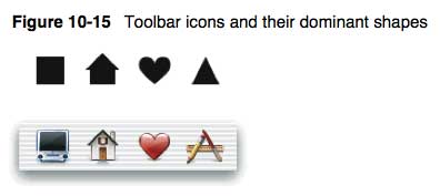
Doh!
There's also the strange case of the conjoined toolbar buttons. As the "customize toolbar" sheet shows, some buttons are available individually, some in groups, and some in both forms. This is inflexible, inconsistent, and again, a little strange.

Mail's "customize toolbar" sheet
I didn't mean to turn this section into a Mail 2.0 intervention, but honestly, it is the poster boy for unexpected graphical changes in the Tiger user interface. I'm all for experimentation; I just hope the next experiment turns out better than this one.
reader comments
1